Roy Lichtenstein
He took the lowliest image in American culture and painted it with the seriousness of a Vermeer.
Style and technique
Lichtenstein's central move was so simple it seemed like a joke: he copied newspaper comic strips — the cheapest, most disposable form of American image-making — and painted them large, in oil on canvas, with the precision of a craftsman. The result looked exactly like a comic strip blown up: the thick black outlines, the flat primary colours, the Benday dots — the mechanical halftone pattern used in cheap printing — applied by hand with a stencil to the painted surface.
The joke was the argument. By treating a comic strip panel with the same formal seriousness as an Old Master painting — by giving it size, care, and the authority of an art-world context — Lichtenstein was asking questions about the difference between high and low culture that no polite answer could resolve. If his 'Drowning Girl' (1963) produces the same aesthetic sensation as a Delacroix drowning figure, what is the difference?
The Benday dot became his signature and his problem simultaneously. In the commercial printing process, the dots are mechanical and invisible at normal reading distance. Lichtenstein applied them manually with a perforated screen, making the invisible visible and the mechanical handmade. This paradox — the mechanical made personal, the impersonal made precious — is the central tension of his entire practice.
Four fingerprints: the Benday dot pattern covering the lighter colour areas, thick black outlines enclosing flat areas of colour, appropriated or invented source imagery from comics, art history, and advertising, and a cool, ironic detachment that never quite tips into contempt for its subjects.
Life and legacy
Lichtenstein was born on 27 October 1923 in New York City, the son of a real estate broker. He grew up in Manhattan and Long Island, attended public school, and took private art classes in his teens. He studied at the Art Students League briefly and then enrolled at Ohio State University in Columbus in 1940.
His education was interrupted by military service between 1943 and 1946 — he served in the Army in Europe and was present at the liberation of Paris. After the war he returned to Ohio State, completed his BFA, and then stayed to teach while earning his MFA. He taught at Ohio State and then at various institutions in New York and New Jersey through the 1950s.
His early work was not Pop. Through the 1950s he worked in an Abstract Expressionist mode, making paintings that showed awareness of de Kooning and Kline without matching their authority. In 1960 he was appointed to the faculty of Douglass College, Rutgers University, where he met Allan Kaprow, an important figure in the Happenings movement, and began thinking differently about the relationship between art and ordinary life.
The transformation happened in 1961. He began making paintings directly based on comic strip panels — apparently in response to a dare from his son, who pointed at a Mickey Mouse comic and said 'I bet you can't paint as good as that.' Whether the story is apocryphal or not, the result was decisive: 'Look Mickey' (1961) and then the series of romance and war comic appropriations that followed.
The dealer Leo Castelli saw the new work and took him on in 1962 — the same year he took on Warhol. The first Lichtenstein show at Castelli sold out before it opened, primarily to other artists and collectors who immediately understood what he was doing. The critical establishment took longer.
He died on 29 September 1997 in New York City, of pneumonia, aged seventy-three.
Five famous paintings
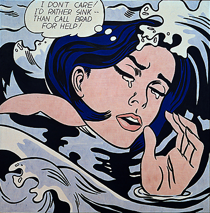
Drowning Girl 1963
A young woman with blue hair disappears beneath stylised ocean waves, her melodramatic expression reading in a caption across the top: 'I don't care! I'd rather sink — than call Brad for help!' The painting is based on a panel from a DC Comics romance comic of the early 1960s, simplified and enlarged to 171 by 170 centimetres. The emotional content of the original — which was presumably moving to its teenage readers — is rendered in Lichtenstein's flat, controlled system of Benday dots, thick outlines, and primary colour. Whether the result is moving, funny, or something that requires a new category is the question the painting poses. It hangs in the Museum of Modern Art in New York.
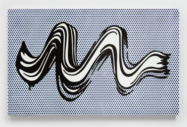
Brushstroke 1965
A single Abstract Expressionist brushstroke — the kind of gesture that defined de Kooning and Kline's entire aesthetic — rendered in Lichtenstein's flat, controlled Pop style: thick black outline, yellow and white areas of colour, Benday dots for shadow. The brushstroke is now a commodity, a quotation, an object of irony. Or it is a genuine brushstroke, made with care and precision in a different but equally valid tradition. The painting refuses to settle this question. It was the first in a series of Brushstroke canvases that Lichtenstein developed through the late 1960s, each one slightly different in scale and orientation.
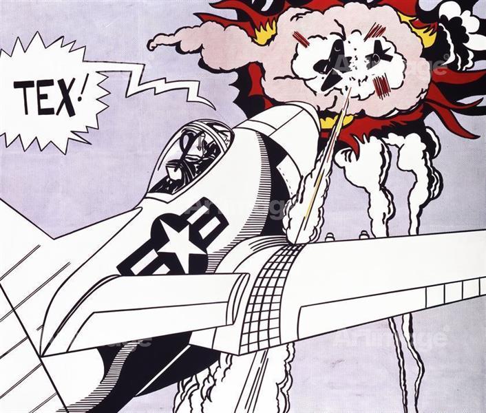
Tex! 1962
An early work from the period when he was just beginning his comic-strip appropriations. A cowboy figure — bold outline, flat colour, the word 'TEX!' as the dominant visual element — shows Lichtenstein's method in its most direct form. The image is taken from a Western comic and rendered in oil and pencil at an enlarged scale. The text — not as caption but as near-abstract graphic form — would remain a recurring element in his work. This early period of direct comic appropriation was the most controversial phase of his career; critics who had respected Abstract Expressionism were genuinely offended by the new work.
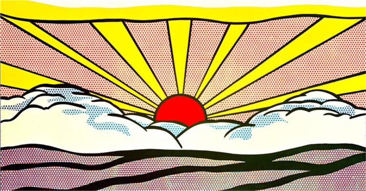
Sunrise 1965
A stylised sunrise — a bright yellow semicircle rising from a flat horizon, with radiating lines suggesting sunbeams against a blue-dot sky — rendered in the Pop vocabulary. The image borrows from landscape postcards and travel advertising of the 1950s and 1960s rather than from comics, showing Lichtenstein's expanding range of source material. The formal result is almost abstract: the sunrise has become a set of geometric relationships — semicircle, radiating lines, Benday-dotted ground — that quote their source while functioning as pure design.
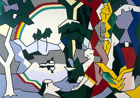
Landscape with Figures and Rainbow 1980
A late work from his extended engagement with stylised landscape, now using a vocabulary developed from 1920s-1930s commercial illustration and travel poster design. Simplified figures stand against a landscape of stylised trees and a rainbow rendered in flat bands of colour with Benday dots. The work shows how Lichtenstein's system could expand to absorb multiple source types: this has nothing to do with comics but everything to do with the same formal concerns — the relationship between a mechanical image-making style and the conventions of art history.