Bridget Riley
She made paintings that move without moving — and in doing so, discovered how perception itself works.
Style and technique
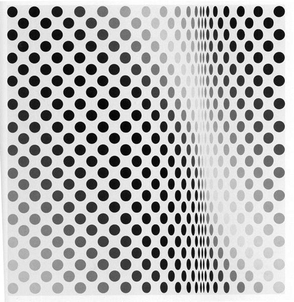
Riley's paintings do something that almost no other paintings do: they produce a direct, involuntary physical sensation in the viewer. Stand in front of one of the black-and-white works of the early 1960s and the patterns pulse, vibrate, seem to advance or recede without anything in the image actually moving. The eye cannot stabilise the surface; it keeps searching for a point of rest and not finding one. The experience is not quite visual and not quite physical — it is perceptual, which is something between the two.
She arrived at this through a series of deliberate explorations of the conditions under which perception becomes unstable. The instability is not accidental but engineered: she works with specific optical phenomena — afterimages, simultaneous contrast, the way the eye adjusts to regular patterns and then fails to adjust — to produce predictable, repeatable effects. The work is made to be experienced by a human visual system, and understanding how that system functions is as important to her practice as understanding how to mix paint.
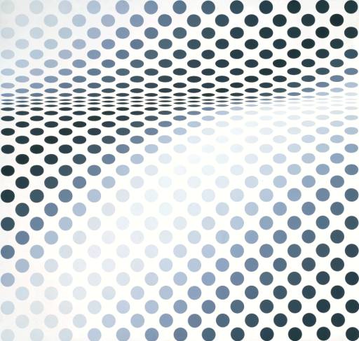
Her black-and-white works of the early 1960s — the period that brought her international fame — use simple geometric units: circles, squares, ellipses, wavy lines. Arranged in regular patterns across the canvas, these units interact in ways that the pattern itself does not predict. In the colour works she began in the later 1960s, the interaction of warm and cool colours, advancing and receding hues, creates different but equally unsettling optical events.
Four fingerprints: black-and-white geometric patterns in the early work that produce movement and depth without depicting either, a systematic approach to optical phenomena in which each painting explores a specific perceptual effect, colour works from the late 1960s onwards using stripes and bands of carefully calculated warm and cool colours, and large scale — the paintings are generally big enough to fill the visual field and prevent the viewer from seeing the whole pattern at once.
Life and legacy
Riley was born on 24 April 1931 in London and grew up in Cornwall and Lincolnshire. She studied at Goldsmiths College and then at the Royal College of Art, graduating in 1955. Her student work was conventionally figurative; her early mature work, through the late 1950s, showed the influence of Georges Seurat and the Pointillists — she spent time making detailed studies of Seurat's 'La Grande Jatte'.
The breakthrough came around 1960–1961, when she began making the black-and-white geometric paintings that would define her public identity for the decade. The early works — circles of varying sizes arranged on grids, wavy lines producing moiré-like patterns — were immediately recognised as something new in British painting. They were technically simple but perceptually radical.
In 1965, 'The Responsive Eye' exhibition at the Museum of Modern Art in New York included several of her paintings and made her internationally famous almost overnight. The exhibition was a cultural moment; Op Art was suddenly everywhere — on fabric, in advertising, in graphic design. Manufacturers appropriated her patterns without permission and without payment, and she had to fight, largely unsuccessfully, to protect her work from commercial exploitation.
The fame brought with it a reductive characterisation that would take years to undo: she was the Op Art woman, the black-and-white painter who made your eyes go funny. The colour works of the later 1960s — which began with vertical stripes of carefully sequenced warm and cool colours — were greeted with uncertainty. They didn't quite fit the expectation she had established.
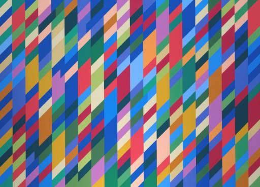
In 1968 she won the International Painting Prize at the Venice Biennale — the first time a British contemporary artist had won it. She used the recognition to begin expanding her vocabulary, and the work of the 1970s and 1980s introduced diagonal movement, curved forms, and increasingly complex colour relationships.
She continues to work and exhibit internationally.
Five famous paintings
Hesitate 1964
A canvas of closely spaced horizontal ellipses — slightly elongated black oval shapes on a white ground — arranged in a grid that is almost but not quite regular. The ellipses vary subtly in size and spacing, and the interaction between the black shapes and the white ground produces a visual tremor that moves across the surface as you look. The title describes the effect accurately: the eye hesitates, cannot settle, keeps searching for a stable reading of a surface that refuses to stay put. It is one of the canonical early works and was included in 'The Responsive Eye' exhibition at MoMA in 1965.
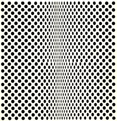
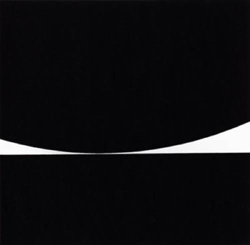
Fission 1963
Circles that vary from small in the upper part of the canvas to large in the lower half, arranged in a regular grid on a white ground. The varying scale creates an apparent curve or bow in the field — the surface seems to swell toward the viewer in the centre. The effect is dizzying and immediate; the word 'fission' is apt, suggesting a splitting or unstable division. This is one of the key works in which the spatial effect of the varying-scale grid was first fully worked out, and it had direct influence on subsequent Op Art production. The painting is in the Museum of Modern Art in New York.
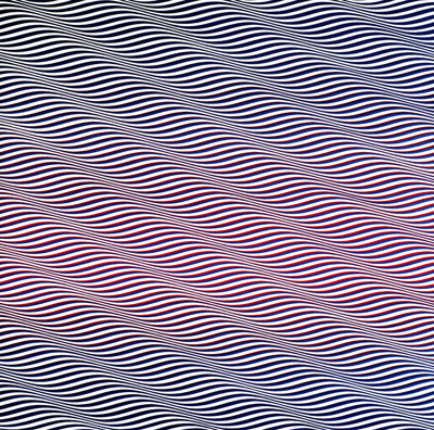
Cataract 3 1967
The title work of a series that marks the transition from her black-and-white phase to colour. Diagonal stripes of carefully sequenced warm and cool colours — red-orange and blue-green — run across the canvas in curves that produce a strong sense of downward flow, like a waterfall or a cascade. The colour interaction here is working differently from the geometric contrast of the early work: the stripes advance and recede according to their colour temperature as much as their position, producing a complex spatial effect. It is one of the most beautiful paintings she has made and a key transitional work.
Nataraja 1993
A late work named after the Hindu god of dance and destruction, who is depicted in a ring of fire. The painting uses her mature colour stripe format — broad, vertical bands of orange, yellow, red, and black — in a composition of extraordinary energy and visual weight. The colour relationships are more complex than in the early stripe paintings, the bands varying in width and the colours chosen for maximum optical interaction. The title suggests her ongoing interest in the relationship between visual sensation and states of heightened consciousness — what painting can produce in the body of the person looking at it.
Kiss 1961
An early work from the moment when she was first exploring what regular pattern could do to the eye. Small black square units are arranged in a grid on a white ground, but at the centre of the canvas the pattern changes — the squares rotate slightly or are displaced, creating a zone of visual turbulence at the heart of an otherwise orderly composition. The title's reference to a kiss suggests intimacy and disruption simultaneously — a touch that changes the arrangement. It is among the first works in which she demonstrated full control over localised optical effects within a larger pattern.