Keith Haring
He drew in subway stations before galleries knew his name, and made an art language that the whole city could read.
Style and technique
Haring's visual language is built from a set of recurring figures and signs that he developed in the late 1970s and early 1980s and maintained with remarkable consistency for the rest of his career. The radiant baby — a crawling infant with lines of energy radiating from it — was the first and most fundamental; it was followed by the barking dog, the flying saucer, the heart, the dancing human figure, the pyramid. These units are combined in ever-varying compositions that cover walls, canvases, tarpaulins, and bodies.
The style is deceptively simple: thick black outlines, flat bright colour fills (in the coloured works), no modelling or shading, a system of marks for energy and movement that reads immediately at any scale. It evolved directly from the graffiti tradition and from the subway advertisement panels where he began his public practice — black panel spaces reserved for paid advertising that were, during the early 1980s, left blank for weeks at a time. Into these blank spaces Haring drew in white chalk, producing hundreds of drawings that were seen by the entire subway-riding public before he had any gallery presence.
The energy that radiates from every figure — the lines streaming outward from bodies and objects — is both a formal device and a conceptual argument: it insists on the interconnectedness of everything, the way energy flows between bodies and between people, the vitality that cannot be contained within a single figure's outline.
Four fingerprints: the bold black outline on every figure, with no interior modelling, the radiant lines that emanate from figures and objects as a signature mark of energy and vitality, bright primary and secondary colour fills in his painted works, and a consistent set of recurring figures — baby, dog, dancing human, heart — combined and recombined in endlessly varied compositions.
Life and legacy
Haring was born on 4 May 1958 in Reading, Pennsylvania, into a middle-class family; his father was an amateur cartoonist who drew for fun and introduced him to cartooning as a child. He studied commercial art briefly in Pittsburgh, then arrived in New York in 1978 and enrolled at the School of Visual Arts.
New York in 1978 was the New York of punk, hip-hop, and the downtown art scene — a city in financial crisis that had somehow produced an extraordinary concentration of young artists, musicians, and writers. Haring encountered Jean-Michel Basquiat, Kenny Scharf, and the broader East Village scene, and absorbed the attitude that art belonged in the street as much as in the studio.
The subway drawings, which he began in 1980, were the foundation of everything. He worked quickly — drawing a complex multi-figure composition in white chalk on a blank black advertising panel in ten to fifteen minutes, moving to the next panel before an employee could see him. He was arrested occasionally but continued. The drawings were seen by thousands of people daily; they established a public presence before any gallery knew who he was.
The gallery representation came in 1982, when he was included in shows in New York and internationally. His first solo show at the Shafrazi Gallery the same year sold out. By 1983 he was internationally famous, collaborating with Warhol, working with fashion designers, producing murals on public walls from New York to Melbourne.
In 1986 he opened the Pop Shop in New York — a store selling affordable merchandise bearing his images. The decision was controversial: established art critics saw it as a commercialisation of his public art practice. Haring saw it as a continuation of his commitment to accessibility — a way of making his images available to people who could not afford gallery prices.
He was diagnosed with AIDS in 1987. He continued to work at full intensity, founding the Keith Haring Foundation in 1989 to support AIDS organisations and programmes for children. He made the AIDS work explicitly and without euphemism, using his visual language to address the epidemic with the same directness he had brought to everything else.
Five famous paintings
The Tree of Monkeys 1984
A tarpaulin covered with a dense composition of interlocked monkey figures arranged around and within a tree form — the figures in his characteristic bold outline and flat colour, energy lines radiating from each one. The tree is a compositional anchor; the monkeys fill every space, above and below and within the branches, in a pattern that extends to every edge of the tarpaulin. The work has the quality of an emblem or a heraldic device — a visual composition that rewards reading as much as looking. It is one of the larger-format works from his most productive period and is characteristic of his ability to fill a large surface with compositional energy.
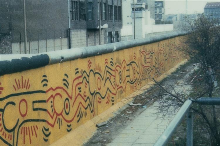
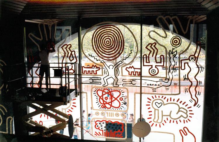
Berlin Mural 1986
A painted section of the Berlin Wall — Haring's 100-metre mural on the western side of the wall, using red, yellow, and black in an interlocking pattern of human figures. The figures form a chain that runs the length of the mural: figures holding each other, figures flowing through each other, figures in patterns of connection and separation. The wall as support gives the work an obvious political charge — the barrier between East and West Germany as the subject and the surface simultaneously. Haring described the mural as an attempt 'to create a work for the West that would be seen from the East', a gesture across a barrier he hoped would fall.
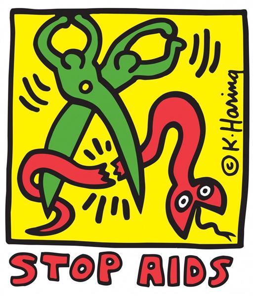
Stop AIDS 1989
One of the most direct of his AIDS advocacy works — a poster design showing a human figure with its hand raised in the stop gesture, the body covered with red and black marks that suggest both energy and infection. The work was made two years after his diagnosis and was distributed as a poster through AIDS organisations and health clinics in a way that deliberately bypassed the art market. The simplicity of the image — the bold outline, the primary colour, the immediately legible sign — makes it a graphic work in the tradition of political poster art as much as a work in the gallery tradition.
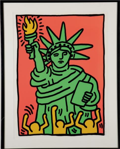
Statue of Liberty 1986
A canvas in which the Statue of Liberty appears as one of his figures — reduced to the characteristic thick outline, the crown replaced by his radiant energy lines, the torch still raised. The work is both a patriotic image and an ironic one: the liberty figure in his visual language is the same as every other human figure — it has the same outline, the same energy, the same status in the composition as any other body. Liberty as radiant body, as energetic figure, as part of the interconnected world rather than as a monument. The painting is in a private collection.
Labyrinth 1989
A late work from the year of his Foundation's establishment, showing a labyrinth pattern — the ancient symbol of the journey inward — populated with his characteristic figures. The figures move through and within the labyrinth, some apparently lost, some apparently finding their way. The labyrinth is both a formal structure (a composition that fills the canvas by folding back on itself) and a metaphor for the situation of his final years — the navigation of illness, public recognition, and the desire to leave something permanent. The work has a quality of reflection unusual in his typically extroverted visual language.